Google+

Friday, December 30, 2011

Uno

Each fall Poydras Home has an large art show. An inventory sheet is sent out in advance for artists to list their art information -  including titles. Well, I'm usually not finished my art before I need to send in the form. So, I started naming some paintings using Spanish numbers. That is how I began my dot art painting series called "Numeros." Here is the first painting.

acrylic on canvas, 20" x 20"

Saturday, December 10, 2011

Abloom

This is my second watercolor on watercolor canvas painting.


watercolor on canvas, 12" x 12"

Tuesday, December 06, 2011

Afire

In the spring of 2005, I purchased some 12" x 12" watercolor canvases. The canvases were covered with a special gesso for watercolor use. So this was a new experience for me. I normally had painted watercolor on paper. The biggest difference with watercolor canvas was the ability to easily pull up the paint. The trade-off was that if I accidentally wet an area the paint would come up too. Anyway, this is one of six pieces I made with watercolor on watercolor canvas.

watercolor on canvas, 12" x 12"

Friday, December 02, 2011

120 Colors

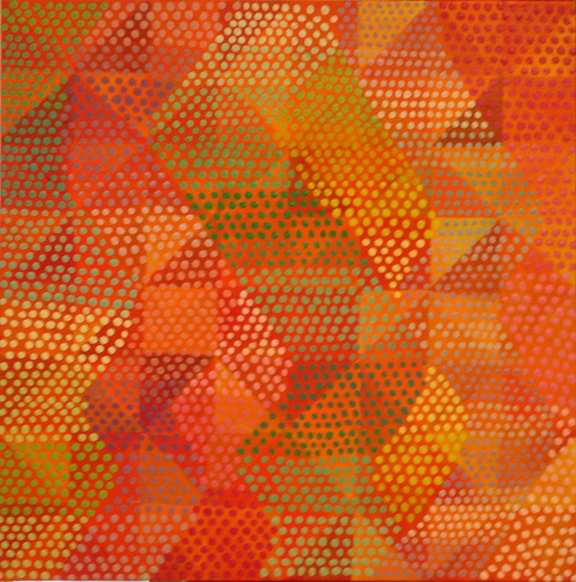
This color pencil piece, “120 Colors” requires a lot more explanation than most of my works. I’ve divided this post up into parts to help keep my thoughts together:

colored pencil on paper, 21" x 26.5"

Combination
Seven years ago an instructor at a workshop suggested to me that I combine some of processes into one piece. Some folks have given me grief about working in all these styles. Unfortunately for me I go through reactionary phases. I swing from one direction to another one. My fellow artists have told me in recent years they recognize what a I do no matter what I do. Yesterday was a deadline for delivering artwork for a weekend art show. Well, I didn’t want to do dots this time. The new paintings appear on my blog art at random.

So what exactly did I combine in this piece? Well, since I’m posting this artwork here, you know there are dots in it. In this instance the use of dots was inspired by the answer bubble sheets used in LEAP testing (the tests Louisiana students have to pass to graduate). It happened that I started this piece in the March of 2005 during “testing week” at a high school where I was teaching art. When this particular week rolls around homeroom teachers administer the tests. I was a substitute for an absent homeroom teacher. Well, I am no fan of this duty – even if it is primarily reading a script.

To begin this piece I created a grid. Then I drew outlines for my dots – like the bubbled in dots I mentioned. The last elements were some squiggly expressionist lines drawn through the grid. But that was only the set-up of parts.

A Whole Set of Color Pencils
Again and again I have listened to artists talk about their limited palette of colors used creating artwork. Well, at that time I was using my fourth 120- color pencil set. Too often there are colors that hardly or ever get used. Anyway, I was bound and determined to use each and every color for once. I was kind of inspired by a “kitsch” art show I saw in Boston at the DeCordova Museum and Sculpture Park.

Random Color Choice
In my last two posts I spoke about my interest in working randomly. Well, unlike my other works that include dots, I chose my combination of colors blindly. Specifically I picked out six pencils at a time without looking. Then I filled in each square, containing dots, on my grid. When finished I placed the six in another container before choosing six more. As I completed a round of choosing every color, then I’d start the rotation back to the original container. It took a long time to render the whole piece.

The Reaction
Needless to say both artists and non-artists have been fascinated by this work. Recently someone told me I should do a close-up study of this piece. At this time I have no specific plans for continuing this tangent of my artwork. Here are some close-up shots.


Monday, November 28, 2011

More Found Object Art

In the fall of 2004 a print shop went out of business. The owner invited my group of art talent teachers over to gather whatever junk we wanted. One item I found was a plastic container of brass tacks. I brought them to my small classroom. Over the next year I wondered what I could possible do with them. I also collected some gold chain from my co-op gallery that closed at end of 2004. You never know when you'll pick up some
neat junk.

And then came the “Not Easel Art” Show. It was the show I mentioned in a previous post that did not include drawings or paintings. I had just worked with tacks. Well now I tried brass tacks. This time I found some odd pieces of wood in the classroom. They were in a box of wood scraps. Each one had a circular hole. I think the pieces supported some kind of pipe at one time.

Anyway, these are two pieces have intrigued people. I decided to make them opposites. One had a hole up and the other one had a hole down. Yes, my titles are usually matter of fact. It helps me to remember what I name my pieces.


Hole Up, brass tacks on wood with chain, 4.5" x 17"


Hole Down, brass tacks on wood with chain, 4.5" x 17"

Thursday, November 24, 2011

Random Wood

From the end of 2003 to the winter of 2005, I continued to have sales of the Greek Code paintings. But as far as producing new dot art, I did not. I kept experimenting and trying new directions. The artist who organized the Sofa Art Show continued to organize more art shows. It wasn't long before she again invited me to participate. Some of those shows had an impact on the new art I created. In 2005 she asked a group of us to create works that did not involve drawing or painting. She and I had attended a number of artist panel discussions that featured artists who were much more conceptual in their art making. She figured we ought to have a go at being more conceptual.

Nail Order, nails and wood, 4" x 6.625"

I had created a number of grid works over a seven-year-period, so I started with one for the first few of these pieces. First I scrounged for hardware and wood scraps in my attic and garage. I had turned 40 the previous year and my house was built the same year I was born. So it seemed natural for me to work with found objects. These were extra items just lying around. I even went to my family’s home to see if there were unused wood scraps or hardware that might make interesting artwork.

Silver Circles, tacks on wood, 7.125" x 18.875"

The first piece was a bit boring. I simply nailed nails in a grid. The second piece is where I happened upon the idea of keeping the pattern more random. The environment at school made me embrace working in a random fashion. Working randomlly was more exciting. To my surprise the creation of these works went super fast.

Sunday, November 20, 2011

Vance Kirkland

Sometimes I happen upon artists whose works relate to what I’m doing in my art. In the spring of 2004, I attended an art educator convention in Denver, Colorado. After an all day bus tour, I spent the following days exploring the city on my own. I attempted to go to The Kirkland Museum of Fine & Decorative Art, but it was not open. The museum was one the art museums listed in an art lover's guide to art museums.

So, then I continued down the street to a state museum. When I was browsing at the gift shop, I ran across several books written about Vance Kirkland’s work. His earlier work resembles the various styles that were popular at the beginning of the last century. Later on his interest turned to images from space and he began to use dots as stars. There’s also an Op (optical illusion) Art feel to these later paintings. Well, I just had to buy the books on his work. They made my luggage come very close to the weight limit on my flight back.

Wednesday, November 16, 2011

Yayoi Kusama

In 1998 I pursued earning my teaching credentials. This meant taking thirty hours of education courses. When I completed the coursework, by the end of 1999, I began to obsess about trends in current art. What was happening that would define 21st century art. My course from 1985 needed some updating. In browsing the art books at Barnes and Noble, I found came across a series of books published by Phaidon. It is called “Contemporary Artists.”

The first book I just happened to discover had artwork that fascinated me. This was before I began working on the first eight code paintings. The artist is Yayoi Kusama and her work (some of her work is visually sexual) happens to include dots. She creates installations that are a combination of feminism, surrealism, pop and minimalism. As I’ve continued to paint the dot paintings, I’ve referred back to her work to spur me forward.

Saturday, November 12, 2011

Dancing Lights


acrylic on canvas, 30' x 30'

Flashing back to the spring of ’03, I was invited to be in a show called “The Sofa Art Show”. The artist organizing the show instructed all participants that works could not be smaller than 30’ x 30’. Well, normally I avoid making artwork that size because working space and storage space is limited at home. Even in the classroom, where I was teaching at the time, space was limited there too. Well, all I had to do was create the one piece and show up for the hanging.

So what did I want to do for imagery? Well, by this point I was wearing glasses for night driving. The glasses helped with making far away signs much clearer. About this time I also started to become more interested in the little blinking dots in the background of movies – that is, when a person was in focus in the foreground while the background was out of focus. Because of what was happening with my eyes, I was now more conscious of the effect. So, that led to the subject of my painting, circles of light at night.

Only recently did I run across terms for the dot display of lights. Both involve photography. The first word I noticed was circles of confusion. Wikipedia’s explanation is a bit complicated, but the general gist is what interests me. Then I noticed a word at the bottom of the page under See also. The word is bokeh. It comes from the Japanese word “boke” meaning “blur”. Anyway, I don’t want to get too bogged down with this other than to state that it is newer facet of my dot art process.

When this piece hung in the show, I received a lot of positive feedback. Since then I’ve posted this on a website and even on this blog. Several people have been moved enough to write to me a bout it. I did create this at the end of an exhausting school year; so, the painting was created in that environment.

Tuesday, November 08, 2011

Storm Scare

In the fall of 2002 two tropical storms came through the New Orleans area. I painted this in reaction to the local drama. Note the tape patterns in the painting. Residents tape up windows just like that before storms.

acrylic on canvas, 18" x 36"

Friday, November 04, 2011

Psi

Finally I come to the last of the four paintings I still own. This design idea was derived from the movie comedy, “American Wedding.” I just thought using a pie image was a natural for my dots. There is nothing specific in the imagery from the film or any of the other ones from the group. At the time I tracked down some photos of pies for the accuracy of my colors. I’m not as satisfied with the results for this one, but there you have the story.


acrylic on canvas, 6" x 6"

Monday, October 31, 2011

Chi

As I continued to paint this series, generating new ideas for patterns became more difficult. My inspiration for this painting came from “Jeepers Creepers 2.” Once I saw the brown colors in the film, I wanted to use them. I placed the dots in an arc path. Although this one is still in my possession, I was pleased with how this one turned out.

acrylic on canvas, 6" x 6"

Thursday, October 27, 2011

Eta

This second painting of the four paintings I have left in this series. It reminds me how difficult it is to paint on top of yellow. The pattern is a repeat from the bigger paintings.

acrylic on canvas, 6" x 6"

Sunday, October 23, 2011

Delta

Of the 24 "The Greek Code" paintings, I only have four left. Here is the first of the remaining four. It is also one of the first four 6" x 6"'s I painted.

acrylic on canvas, 6" x 6"

Wednesday, October 19, 2011

A Shift in Patterns

So, does this pattern remind you of any particular film? Maybe if I gave you a choice of the red pill or the blue pill? Does that ring any bells?

Sigma, acrylic on canvas, 6" x 6"


Hopefully by now you’ve guessed, “The Matrix”. By the way it sold not too long after I painted it. When I did this piece I started to imitate the way a string of lights implies motion. In films about Las Vegas casinos there are often flashing signs implying motion. Anyway, this particular painting marked a turning point for the patterns I picked. I had run out of geometric patterns to try; so, I started to look for other shapes.

I do love going to see films, both blockbusters and art-house. During the summer I came up with designs to complete the set of twenty-four. I found them when I watched films during the summer of 2003.

Unfortunately I neglected to take pictures of the remaining works from this series. I didn’t count on them selling the way they did, nor did I figure that I would continue painting in this direction. Before Hurricane Katrina I had seven of them left. Now I only have four left - three sold since I am back. One is from the original four. Another one is from before the one above. And two more were painted after this one.

Saturday, October 15, 2011

The Greek Code

Here are some more of my small dot paintings with Greek names. The picture was taken at Anglade-Barthelemy Gallery, a co-op gallery on Royal Street. I exhibited art there 1997 through 2004 when it closed for good. By the time this picture was taken I had already sold a few from the series.

 After using a number of predictable patterns, I became frustrated. What pattern was I going to use next? At this point I was stumped. It was the summer of 2003 when the answer came to me . . .

Alpha, Gamma, Delta, Epsilon, Zeta, Theta, Kappa, Lambda, Mu, Nu, Omicron, Pi, Rho acrylic on canvas, 6" x 6" each

Tuesday, October 11, 2011

Going to Small

So, how did I end up painting such small paintings? Well, it all started with a gallery located in Algiers Point called Lallybroch Gallery. The artist organization ARTinA (Art in Algiers), which I belong to, was invited to have a show at the gallery. Because the gallery was small, the artists were asked to bring small artwork for the show.

When I went to the art supply store, I zeroed in on canvases that were 6” x 6” in size. Similar to the eight pieces I created, I painted dots over a triangle pattern. The paintings below are the first four I painted. In May of 2002 I saw the film “Enigma” which concerns a group of British young people who cracked the Nazi code during World War II. Seeing the film inspired me further in the direction begun with the first eight paintings. I was simply intrigued with patterns as a visual expression, not as a hidden message. Then I had to find titles for these paintings. I settled on the names of the letters from the Greek Alphabet. They often turn up in our pop culture and I thought they would be appropriate for my new paintings. Thus I named the four: Alpha, Beta, Gamma and Delta.

The reception was in early July of 2002. In New Orleans that is a hot and humid time of year. Unfortunately for everyone who attended the opening, the gallery was hot. As I wandered around, my fellow artists and my family were excited about these small pieces. They told me I should do more of them.

When the show came down, none of the works had sold. That didn’t discourage me from painting more canvases that size. Besides the ARTinA Festival was coming up in October and I figured small pieces would be an ideal item to sell . . .

Alpha, Beta, Gamma and Delta, 6" x 6"'s, acrylic on canvas

Friday, October 07, 2011

Code Pink

Pink was my color choice for my last painting of this batch. I chose pink over magenta. Too many folks would not recognize the name.

 This painting proved a lot more fun when I played with colors on top of pink. It gave me the opportunity to vary dot sizes in rendering an "X" pattern. There's no message. "X" was just a design device.

 When "Code Pink" won a first place ribbon, I was definitely "tickled pink." Many people have told me they liked this painting. So, this concludes the story of the eight paintings.

acrylic on canvas, 22" x 28"

Monday, October 03, 2011

Code Lime

After using the three primary colors and three secondary colors, I had to decide on what color to use next. I wanted colors with single names and not hyphenated names involving the first six colors. That lead me to choose "lime." Some might argue "Lime Green" would be the full name. I figured "lime" was enough information in naming a color.

Having used a double spiral in another painting, I figured I'd use a single spiral in this painting. Passersby have often stopped to gaze at it and then talk to me about it. I guess that's better than having my piece ignored.

 Again, like the two paintings just before this one, I had trouble with putting colors on top of my background colors. I had to mix colors even more for this painting. The result was a more muted painting.

acrylic on canvas, 22" x 28"

Thursday, September 29, 2011

Code Yellow

Finally, I painted a mainly yellow canvas. It also proved to be a difficult color. Yellow was such a bright color, I had trouble placing other colors on top of it. Whereas I tried to use the same colors among all the paintings, I was forced to alter some colors because of the color shift among adjacent colors.

 The pattern goes back to a "S" pattern used on my family's towels. I mimicked its double spiral. As for whether people saw an "S" in the painting was not important to me.

 The pastels in this painting made it more childlike, playful and happy. The personality of this piece just sort of happened. It wasn't something I planned.

acrylic on canvas, 22" x 28"

Sunday, September 25, 2011

Code Green

Having completed four paintings, I set about creating four more. My goal was to have eight paintings that would hang in an alternative space corridor on Poydras Street in downtown New Orleans. An art guild I belonged to had been invited to hang art there on a rotating basis.

 In keeping with basic colors from the color wheel, I chose to make the next canvas predominantly green. As I continued my process, I found green to be a very difficult color. It was so dark. So, I contrasted green with colors from complementary and lighter colors.

acrylic on canvas, 22" x 28"

Wednesday, September 21, 2011

Code Orange

This was the first canvas when I began my process. It ended up being the last, of the four, when I finished. Working on the four canvases simultaneously wore me out. Along the way I changed my mind many times. The layers of paint bear that out.

acrylic on canvas, 22" x 28"

Saturday, September 17, 2011

Code Red

When I worked on my red painting, the dot pattern clicked in a special way. It is my favorite one of these four paintings. This painting won a second place in an art show competition and the title of "Artist of the Month" in a peer voting art competition.

 "Code Red" marked a breakthrough for me. The process was a new way of painting for me. I was tired my surreal and expressionist methods of painting in acrylics. It was important for me to explore other ways of using the medium.

acrylic on canvas, 22" x 28"

Tuesday, September 13, 2011

Code Blue

Eventually, I was painting four of these 22" x 28" canvases simultaneously. This painting is very similar to "Code Purple" in pattern and dot shapes. I repeated the columned pattern on the sides.

 When I began to think about a name for these paintings, I thought of "Code Blue." Around this time a color code had been introduced as a warning system for level of "terrorist threat." Also, around this time my mother, who had undergone treatments for breast cancer, ended up in the hospital. Anyway, the two concerns helped me name my four paintings.

 In choosing my colors I made a point of including colors from the other paintings in addition to the predominant color. Many people have commented on these works looking like quilts. In fact some quilters have come up to me to talk about these paintings.

acrylic on canvas, 22" x 28"

Friday, September 09, 2011

Code Purple

The answer came to me as I was pondering what to do. I needed to soften my image. That's when I decided to use dots.

At first I wanted the dots to be expressive. I didn't want to have them controlled. However, I was not as pleased with the result. But I liked what was happening better with dots than without them.

To me this pattern reminded me of light bouncing off a mirror ball all over a room. The pattern was hemmed in by one column on the right and another on the left. I did have trouble with my hand resting on wet dots and smearing the paint.

acrylic on canvas, 22" x 28"

Monday, September 05, 2011

Process

In the beginning of 2002, I gridded off four 22" x 28" canvases. One I painted primarily orange, another purple, another blue and finally one red. Using acrylic paint I began by making all my triangles flat. I made sure that some of the colors appeared on every one of the canvases plus I added a few more. But I was visually bored.

So I experimented with depicting light shining through the triangles. That still didn't satisfy me. Eventually I painted over the triangles. At this point I was aggravated. The harsh triangles bugged me.

Unfortunately I didn't take photos along the way. So I have no documentation of what went on I as I painted each layer of paint. It wasn't until the next phase that I had an
"aha" moment.

Thursday, September 01, 2011

Watercolor Grid

Purple was another color in the Uniball set, besides orange. This was a painting study on a letter size piece of paper, 8.5" x 11". Blue and pink were the two remaining colors in the set. I ended up using all four colors eventually, but that came later in my process.

watercolor on paper, 8.5" x 11"

Sunday, August 28, 2011

Color Grid

After drawing patterns inside the triangles of several grids, I experimented with
color inside a grid, using color pencils. I drew the sketch below in a small sketchbook
I had. Although I primarily used it as a scrapbook, I sometimes used it for playing with
art media.

 Beginning in 2002, I took a liking to the color orange. A film poster and an art ed convention logo both used oranges in pairs in their designs: one like glasses over eyes and the other as bicycle wheels. The coincidence appealed to me at the time. Also, Uniball came out with a pen set including an orange pen. Now and then I have color obsessions. That's how this sketch began. I played with other colors while deciding what I might want to do for a finished piece.

color pencil on paper, 5.5" x 8.5"

Tuesday, August 16, 2011

How My Current Art Began

In the fall of 2001 I was a talent visual art teacher responsible for a caseload of elementary talent art students at four schools. I was filling in for a talent art teacher who was on sabbatical. When I tried to explain the art term “value” to my students all I saw were blank confused looks.

So I came up with a grid of triangles. I handed each of them a grid to draw patterns in each triangle – lines and dots. Before having them start, I held up a sample grid I had drawn. When they finished drawing patterns, I held up each page so they could view the results from a distance.

And what does this have to do with my dot art? Well, this is where my current art began. I created this patterned grid. After that I played with color in a similar grid. These were rough ideas leading up to my dot paintings. Below is the first of three ink drawings I made.

ink on paper, 8.5" x 11"

Friday, August 12, 2011

Stop/Go

"Stop/Go" was inspired by the movie "The Mexican" from 2001. Brad Pitt's character is
at a stop light which becomes a pivotal moment for him. It captured my indecision
at the time.

In this piece I wanted to play with variations of the complementary colors "red" and "green". This piece reflects my fascination with Victor Vasareley artwork. However, in rendering the drawing I wanted to keep it more expressive and soft edged.

colored pencil on paper, 15.25" x 24"

Monday, August 08, 2011

Three Years Later

It would be three more years before I'd come back to dots in my artwork. And even then, I failed to get a picture of the piece before it sold. It was a long narrow horizontal color pencil drawing. The background was a transition of color behind scattered dots. I barely had a chance to exhibit the piece before it suddenly sold at a show.

Thursday, August 04, 2011

Green Dreaming

This is one three paintings from 1995; however I never completed the other two. They remain only partially done. For some reason those paintings never really clicked.

I worked on this one during a Fine Arts day at a girl's Catholic school. Every year the school invites artists to demonstrate or have hands on materials for the girls to try. The girls visit each artist table. I had several pieces I painted on that day.

acrylic on canvas, 12" x 16"

Sunday, July 31, 2011

Australian Christmas

In 1994 I was invited to be in a Christmas themed art show at our World Trade Center, at the foot of Canal Street - across from Harrah's. This small exhibit was on one side of the front lobby. The other side had the traditional large Christmas tree, train and traintrack that encircled the tree.

Since the show was at our World Trade Center, we were asked to select a country and look up information on how that country celebrated Christmas. For this show I chose Australia. First of all it is summer down there at Christmas. The beach is a popular place to be. There is "Caroling by Candlelight" on the beach. So, I focused on the candlelight tradition. Painting in an Aboriginal style, I used dots to capture the effect of lights - candles and stars. An aunt, who is often critical of my work, told me she was buying it. It now hangs in her kitchen.

Besides the sale, I had a lot of positive feedback from artists and non-artists when it hung in the show. In spite of all that, I did not pursue making more dot paintings. There were other methods I wanted to try first.

acrylic on canvas, 12" x 16"

Wednesday, July 27, 2011

Ivy in the Sun

Here's a painting I created on my own after taking a class with local artist Glen Weber. I used color tricks I learned in his class. This is the only record I have of it. I painted this to be auctioned during the annual WYES Art Auction, our local PBS Station's fundraiser.


acrylic on canvas, 18" x 36"

Saturday, July 23, 2011

Sand Dune

Up until now I've shown you Louisiana themed landscapes from the painting class. Here is a generic sand dune scene I painted. I included a sailboat in the background. Again, the instructor had me play visual games with the colors I used. This one was done a smaller canvas board.

oil on canvas board, 16" x 20"

Tuesday, July 19, 2011

Swamp

For some reason I didn't get too far with this painting. Perhaps I ran late that day. Anyway, my painting strokes are more dot-like. After the class, I didn't know how I wanted to finish it. Thus I left it as is.

oil on canvas, 18" x 24"

Friday, July 15, 2011

Oak Tree

Another painting I painted in the class was a scene with an oak tree. Glen Weber showed us how to contrast blues and oranges and create light and shadow. I learned a lot about color juxtaposition while rendering this painting.

oil on canvas, 18" x 24"

Monday, July 11, 2011

Marsh

During the summer of 1994, I took oil painting classes from local artist Glen Weber. I was drawn to his work because of his Impressionist method of painting. In his classes, I learned how to work with color to create light and shadow. He demonstrated tricks for making parts of a painting come forward and go backward. By the end of the summer I had a better feel for color than I did previously.

One of the first paintings he had us make was of a marsh. He instructed us to use a "letter B" as a basis for a composition. We skewed it to show perspective.

oil on canvas, 18" x 24"

Thursday, July 07, 2011

Nine Masks in Blue

And finally here is third painting I made of sequined masks. I then went back to painting my loose abstract water paintings. But it wouldn't be long before I made one more stab at an Aboriginal styled painting.

acrylic on canvas, 16" x 20"

Sunday, July 03, 2011

Eight Masks in Blue

Here is the second piece completed at the time, "Eight Masks in Blue." I figured I should keep my colors simple since I was still learning how to handle the dots. Again, I intended the dots to look like sequins.

acrylic on canvas, 16" x 20"

Wednesday, June 29, 2011

The Aboriginal Influence

Twenty-four years ago, last May, I graduated from Mississippi State with a BFA in Graphic Design and other emphases in Photography and Painting – meaning I had twelve plus hours in both areas. The jobs I had after graduating were in pre-press. As for my fine art, I did a lot of experimenting with the techniques I had learned in school. Many of them were rooted in “happy accidents.” Generating unexpected imagery was more exciting to me than planning one out and then simply executing it. My blogs mind places and slingin paint cover the majority of the artwork I created between 1984 and 2000. The dot art was not a high priority. It has something that I’ve come back to at different times.

By 1993 I did some substitute teaching at my old school. My former high school art teacher had me substitute for him. Another art teacher had swapped with him in order to teach high school. She had become interested in the art created by Aboriginals and she had her students painting with enamel paint pens on canvas. Also, she was working on her own painting using the same method. It was at this point I had a chance to view a book of Aboriginal Art.

Suddenly I was excited about trying the method myself. Around this time I became interested in art that had a primitive expressive edge. In attempting dot painting, I was determined to do something that was more connected to New Orleans, since it is where was born and have lived all my life – except when I was in Starkville, MS for collge. It happened that an art association was having a Mardi-Gras-themed art show. So that became my opportunity to try out the dots. My dots became sequins. Below I have posted one of three I painted. It is called "Five Masks in Blue."

acrylic on canvas, 16" x 20"

Saturday, June 25, 2011

Post-Impressionism

This was a project from my Painting I class at Mississippi State. All the projects for the course were painted in oils. I painted this one in the spring of 1984. We were instructed to use dots of pure color and place complementary colors adjacent to each other. We were using the Seurat Post-Impressionistic approach.

I had enjoyed playing with Impressionism in high school art classes. When this project came along I was thrilled.

I used an old photo of my grandfather and his cousin picnicking on the levee for my composition. I had to imagine color for this shot. At the time I did not have color levee photos to aid me.

The painting project that immediately followed this one consisted of collaged imagery. We were asked to be more personal in subject matter and to choose how we would render the piece. I mention the project because I had painterly water like Monet. You can see the painting "Cat Slide Water" on my blog, mind places.


oil on canvas, 28" x 36"

Tuesday, June 21, 2011

A Painting for My School

My high school headmaster requested a do a painting to hang at school. That is how this painting came to be. It hung in the school library. The painting was returned to me sometime before Katrina. Fortunately I had it at my house, which did not flood.


acrylic on canvas pad, 16" x 20"

Friday, June 17, 2011

Water's Edge

Next I painted this landscape. I wrestled with bringing trees forward and backward in space. My high school art teacher advised me on placing reflections of the sky in
the water.

When I finally finished this piece, I gave it to my mother. She had it framed and hung it among a collection of Impressionist styled paintings in her living room. Several of the paintings she had in her house had an impact of use of color and brushstrokes.


acrylic on canvas pad, 12" x 16"